Monday, April 04, 2011

P S


By the way - I should have said - obviously this blog is not a shop but I intend to try and set up an Etsy shop or similar fairly soon, if I can work it out! has anyone tried it? Can you let me know how it went? Meanwhile all the jewellery is for sale and other stuff can be commissioned so if anyone is interested, please get in touch or put them in touch...

On another subject, I have finally finished some artwork I promised someone ages ago - sometimes I can get stuff done immediately and sometimes there's just no inspiration ... So Lou, if you read this, the journal pages are finally on their way! Perhaps because I have transferred my obsessiveness to jewellery, I am finding far more inspiration there - perhaps I should try to transfer jewellery design to papercraft, now there's a thought. Off to ponder on that one ...

Sunday, April 03, 2011

I'm still here!!!


Another post with this title. I can't believe how long it is since I posted. I have been having a very busy time and blogs and internet have been the last things on my mind I'm afraid.
Anyway here I am, I have taken up jewellery making, and am hoping I can sell some, I am at that stage in life where I desperately want to retire but still need some form of income! I guess a lot of people can relate to that. Anyway I will try not to leave it so long before I post again, thanks so much to those of you who are still following me, you have been very patient.

Saturday, April 24, 2010

Altered Key Cabinet

The other day, my friend Carol and I got together to have a play day and decided we would alter some key cabinets. We each had one from a well-known high street store with initials in its name, which I find is a good source of small mdf items to alter. In the past I've had mini chests of drawers, tool caddies and a key rack. (OK, it's T K Maxx)

Anyway, they both originally had rather lurid pictures of roses on them. For some reason I NEVER like images of roses. I love the flowers themselves, and I like other flower pictures, but I never ever like rose pictures, not even photographs. I forgot to photograph the cabinets before we started, but here is the front of another piece waiting to be altered, with the same dreadful rose on it:


Carol and I chose quite different approaches - she is a very tidy and classic designer, I tend more towards slap it on and see where it goes, and it ends up more grungy. I started by taking the door and the door knob off to give myself a blank canvas, then I cut a piece of corrugated board to fit. I distressed the board with a bit of brown emulsion paint and some gold acrylic paint, very roughly dry-brushed on, then I embossed the edges with some Cosmic Shimmer EP in a greeny-black colour. I stuck this on with PVA. I took 3 tags and decorated them, firstly by inking the edges and then stencilling with some of the new DI's then I stamped with my new Tim Holtz set "Purely Random" which has a gorgeous elephant among other things! I embossed the edges very roughly with more cosmic shimmer and an unknown EP that my friend Sue was chucking out before moving house. I then added some short ribbons and stuck them on, allowing for the door knob to go back! I had some new Marianne dies that I bought from Paddy's Stamping Place so I pinched a bit of K&Co paper that Carol had with her and chopped out some leaves and flowers with my trusty Cuttlebug, distressed them then stuck them on with Pinflair glue. (that stuff is brilliant!)

Carol painted hers a lovely dark red with some emulsion paint then stencilled swirls over it with Crushed Sapphire DI. She made a lovely 2 dimensional butterfly and added some gems to it and stuck that on the front. Hers is what I would call sophisticated and elegant! Quite a contrast to mine which I can only describe as "rustic" ! Forgot to take a pic of Carol's, sorry - if I get one I'll post it another time!
Here's mine anyway:

Sunday, April 18, 2010

Stash Box workshop

The Stash Box workshop went ahead yesterday as planned with three attendees including Paddy, who did finish the project, apart from the varnishing! For all who know her, this is amazing, as she is usually distracted and interrupted all day long by the shop, phone and visitors, or starts off doing the workshop project then goes off at a tangent.
Anne and Sharon, (hope I've spelt you right girls) were the other two, they are sisters-in-law from Blackburn and very talented and very funny! The day flew by. My worries about not finishing the project in the day were unfounded, we finished in plenty of time for them to have a good browse and pick up a few crafting essentials! Here are some pics - my apologies to Anne for lousy photography, but my pics of your pretty box were too blurred to use - even my photo editing s/w couldn't make a good job. For everyone else, Anne's box was a lovely riot of spring colours, just right for this time of year. You can see it part-finished in the last photo.
All the stamps used and inks are available from Paddy's Stamping Place:
www.paddystampingplace.co.uk

This is an extra sample I finished the night before - although it's not really finished, don't look at the back!!!!


These next two are Paddy's - gorgeous naturally, her colours are beautiful, my photograph hasn't really done them justice, they are more vibrant in real life AND she managed to incorporate her current fave product - velvet ricrac ribbon! She chose her box colours to go with the colours of ribbon that she had:


This is Sharon's box in progress - she chose a lovely warm colour scheme, using the new DI's, as Paddy had - there are some gorgeous colours as you can see. Sharon added a lot more detail to this before she had finished, and it looked really pretty - as we said, one can hide craft stash all over the house in boxes like this!


Finally here is everyone hard at work - I was obviously cracking the whip quite hard at this point!
Paddy:

Anne and Sharon:


If you want to come along and join in a workshop, ring Paddy on 0161 798 5115 or call in the shop and she will tell you what is coming up.

Thursday, April 15, 2010

Workshop at Paddy's - Stash boxes


I've been a bit absent from blogland for a while - lots of reasons, one of which is that I have been preparing stuff for a workshop I'm doing at Paddy's Stamping Place in Prestwich this Saturday 17th April and repeating the following Friday, 23rd.
These are a couple of "sneaky peeks" of the stash storage boxes we will be making from recycled packaging. There are still places available, if you would like to come along, phone Paddy on 0161 798 5115, she'll fit you in I'm sure! If you do, I'll "show and tell" the story of the disaster that happened to another sample (which was the girly one, if you are thinking these two are a bit macho)!!!
By the way, that reminds me, I am also going to be doing a "man cards" workshop there in a few weeks, no sneaky peeks of that one yet I'm afraid, but it's before Father's day, if anyone is stuck!

Monday, February 22, 2010

Play date cafe 17

This weeks colours for the Play Date Cafe challenge were great I thought, until I tried to use them and found that nothing I did turned out right!


Meanwhile I had been making tags to cover art journals with, (see previous post if you would like to have a look at them) so I thought I might try one of those as they seemed to be coming together well, so here it is, mounted onto a card decorated with a Martha Stewart punch. BTW I met some people last week who did not know she had been to jail - how did they miss it?


I love putting little bits of things inside those Tim Holtz book plates and filling them with Glossy Accents to seal it all in.

Art Journals

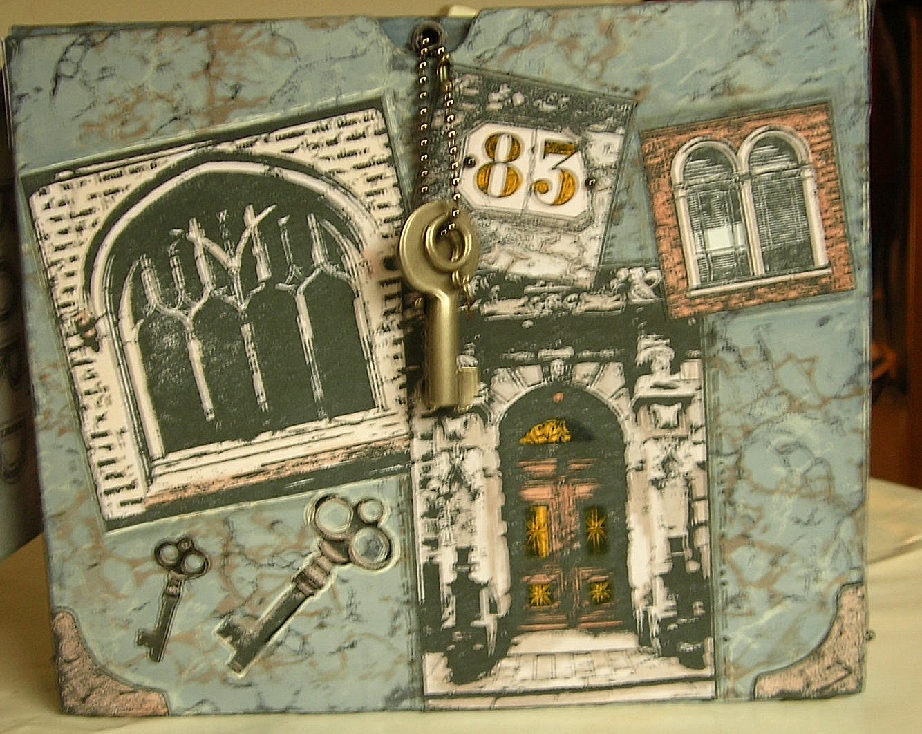
Lately I have been looking at my Art Journals and thinking that the covers were very dull, so I decided to bling them up a bit!

This first one is about 8" square, and is about half filled. A few pages have birds or other natural images on them so I wanted to follow on with that, without making the cover another journal page as such. I love adding 3D elements to artwork, but you can't do that too much inside the journal as the pages won't close if you do, so I contented myself with putting them on the cover. The tag was made a few weeks ago using one of TH's Distress Ink / Perfect Pearls techniques, also recently demo'd on C & C. Several bits move or dangle. You can see I am a fan of T. Holtz ideologies!


By contrast this one is very small, 4" approx, and I have kept the decoration very simple. I shall use this one for lettering. I love the beaded trim, (more movement) and the leaves were stencilled through a Stewart Gill stencil with Viva 3D Glitter Gel in Haematite.


I think this next one is my favourite! The journal is about DL size, and I have started using it. I stencilled a design on it with Brilliance Platinum then added some German Scrap. I Glimmer misted the tag, which was black, added a strip of GM'd text from a book in Polish (or it may be Czech I'm not sure as I don't know either language). Then I added a flower made from parts of several other flowers and various metal embellishments including part of an old earring and stuck it on. I stuck a few tiny bits together to make the 3 small pieces across the bottom. Again, a couple of the items move around as you handle the journal.


This last item is for "Stash Lists" as you can see from the front - this has lists of which colours I have in each kind of pad, Alcohol Inks, CB folders and dies I already have etc - with any luck, if I remember to take it with, I shall avoid duplications in future when I go craft shopping!! The book is about A6 size and was shocking pink so I toned it down with white acrylic paint, wrote out the title and added it along with some black lacy braid down the sides. Then I made a tag, using some more of the Polish text. I stuck on some black wired beads from a wedding shop, some T Holtz film strip, a couple of stamped images and some more moveable TH ideologies. And gems. Phew!


When I have finished using the books I shall add ribbons, beads, mini tags etc to the bindings, but it would make them too difficult to use if I did it at this stage!
Hope you like them.

Very big welcome to my new followers - It is very gratifying when people want to see my stuff, thank you so much! Please leave me comments or questions if you have time, I love to know people have been calling in.

Suze Weinberg Workshop

Here are some pictures of a workshop I went to at Craftrange in Burnley recently, given by the world famous Suze Weinberg. It was all about melt art, naturally. Suze was very friendly and down to earth, seemed to be enjoying her trip to the UK. We started off by making wax collages, which unfortunately I don't have a decent photo of - I was not too happy with mine. I shall try and post one another time when I do a better one (if!!) Then we went on to work with UTEE which was great, and we made a lot of small items which are very pretty. Again, I shall post some photos another time. There are some good pics on Suze's blog : http://suzeweinberg.typepad.com/suzeblogz/2010/02/life-is-goooooood.html
except there is a dreadful one of me.

This is my mate Carol with Suze - Debbie, who owns the shop with her husband Michael is looking on:


Here is Suze mid-demo:


And for those of you with perpetually messy desks like me, here is Suze's - just as bad!!

Monday, February 15, 2010

Play Date Cafe 16

I can't believe the is 16 weeks old! The colours this week are not often seen together - a very unusual and funky combination of red, lavender and silver -

and what a super photograph again! I'd love to be able to take pictures as well as that.
I sometimes find "lavender" a bit vague - is it pale blue or pale purple? - so having the photo helps. Anyway, I had got my hands on some new Martha Stewart border/corner punches this week, which chomped through the silver paper beautifully, and also had a play date with friend of mine who wanted to make some bookmarks as gifts. In a search for suitable (tall thin) stamps I found some lovely Elusive Images DL sets that hadn't seen ink for a while at the back of the box. They are now promoted to the front as they are so pretty. Having said that, I don't normally do "pretty" so this card is a bit outside the box for me, with bling, sparkle, silver, flowers and a fairly conventional design. I hope you like it. (After I said I wouldn't enter a card as well!)

Monday, February 08, 2010

Another Altered Box!

Though not really altered as it's still a box. Never been too sure - to qualify as "altered art" does it have to change its function or only its appearance?


Anyway, this started off when my mate Carol and I got together at my house, me being post-operative and slightly delicate, for a play day. We decided to have a go at a box - I have done lots before but Carol hadn't ever done one. So we set to on the kitchen table with empty boxes which we checked over for rough bits. We selected some pretty paper, each picking a set to stick to so that they would blend well. We measured and cut the pieces we would need, saving the left-over bits. We stuck them on, wrapping a little on the front edges (with hindsight, I forgot that it's best also to wrap the sides slightly as well, so we didn't do that!)
Once dry we gave them a light coat of gesso, cheap variety! Not going for full coverage, I wanted the patterned paper to show through. While the gesso dried we stamped some images onto the scraps of patterned paper we had saved. When it was dry we stuck these on to our boxes. I also stamped direct onto the box here and there to "fill" and I outlined the stuck on bits with charcoal pencils and a blending stump to make them pop out a bit. You could also use Promarkers or similar and blend them in. I cut some small strips to cover my edges (should have done it earlier!) then I went over it all with rub-on wax, especially round all the edges to "distress" it. If it is likely to get handled a lot, sealing with a varnish (I prefer matte) would be a good idea. The handle can be anything you can get hold of easily - mine is a large glass bead which happened to match the colours - I fed some cord through and tied it to a smaller plain bead inside to keep it secure.
You can also paint the insides or line them with pretty paper or fabric, depending what you want to use it for.

Sunday, February 07, 2010

Play Date Cafe No 15


I love this week's Play Date Cafe challenge colours! and the image of the feathers is lovely - where can we get feathers on a roll in the UK? Anybody?
Anyway, one of the reasons I love these colours is that they can be either subtle or bright, depending on your mood, or a combination I guess!
I normally stamp stuff, but this time I used some images by Mary Engelbert to decorate a very small tag book - I was looking for something else and found this little pad of images that I had forgotten I had. They remind me of my favourite artist when I was a child - Mabel Lucie Atwell (though Mabel's little girls were never so stroppy as this lot!)

(Edit - photos changed for ones that are more in focus!)(I hope)


I don't know where I got the tag book, it's chipboard and about atc size. The paints were mostly match pots to start, overlaid with Distress Crackles, Precious Metal paints and Ferro, and the bits and pieces are from my embellishments drawer (yes I'm so sad, I have a whole drawer!)
Hope you like it!

Tuesday, January 26, 2010

Play date Cafe Challenge No 13

This is the colour palette for this week's Play Date Cafe challenge - not colours I would ever have thought of putting together - so an excellent challenge. Very Retro look I think and a fab photo:


While I was thinking about it, my eye landed on a laundry tablet box in just the right colour. I use these boxes to make "treasure boxes" or storage for crafting stash, so the two ideas came together and this is the result:


The photo isn't that great, the tassel is actually a perfect shade of turquoise and the glitter on the flowers doesn't show at all! The stamps are all Studio 490 Wendy Vecchi by Stampers Anonymous, the plate is called Lower Case Art.

Hope you like it.

Saturday, January 23, 2010

Back to Basics!


These 2 little cards are a definite step back for me, almost to when I first started card-making! Although I wouldn't have used stamped images then - instead I would have cut something out and stuck it on. That phase lasted about 3 weeks I think! Then I discovered stamping via Glenda Waterworth on TV, then grunge, then Tim Holtz, Craft Stamper, Sue Roddis's wonderful Altered Art .... then I visited Paddy's Stamping Place and life was never quite the same again!
Anyway this week I wanted to make some cards for non-crafters who really don't appreciate anything too "out-there" so out came the glue and the pretty papers (these ones were free with a magazine) and the ribbon. I was pleased with the result - I think the colours work well. I may use the designs again, next time a bit more "from scratch" though. Let me know what you think? It would be easy enough to make the background paper with inks and stamps and get similar effects.

Friday, January 22, 2010

Workshop Samples


These are two cards that I have prepared in advance for a workshop I will do some time at Paddy's. I was going to do it in a couple of weeks time but I have just been given a date for a "procedure" to be done on my shoulder next Thursday and I don't know how fit I will be afterwards so I've cancelled it. But if I can get more samples done beforehand I will be ready to "rock and roll" as soon as my shoulder settles down, whenever Paddy has a space in the diary!
These two have a bit of a theme don't they? Colours very similar, and good for "Man" cards, which is a bit outside my comfort zone. The stamps are Elusive Images or Creative Expressions and the inks used are mainly DI's. I love that long number stamp which I've used as a border. It occurred to me that if you picked out the relevant numbers in another colour, you could make it for any birthday - 26, 57, 93 etc!
Anyway I hope you like them.

Sunday, January 10, 2010

Play Date Cafe No 11


I've been lacking in inspiration lately, but when I saw the Design Team's and Sue's entries for The Play Date Cafe challenge, I felt I wanted to have a go. I have to say Sarah's bird particularly tickled me!
So here is my entry. The photo isn't brilliant - the orangy bit is just a reflection in the mirri board, it's gold in real life. A little scrap of embossed black paper was dusted with gold pearl powder and a scrap of text was brushed over with gesso. These two combined to form a base for the silver mirri which was cuttlebugged, then wiped with versamark and embossed with black UTEE, which gave the very rough effect I was looking for. The gold mirri was put through a cuttlebug then stained with black Stazon, then mounted on a black card which had had a wide gold ribbon attached. The small panel and a white flower highlighted with gold Krylon and a skeleton leaf were stuck on. Some tiny mosaic tiles and adhesive pearls finished it off. Hope you like it.

Wednesday, November 25, 2009

Dad

Thank you all so much for your kind thoughts and prayers. Dad died peacefully last night, after a long time trapped in a body that would not work. He's at peace now and we are all grateful for that, though sad. I'll be back when I can.

Sunday, November 22, 2009

Sorry

Sorry but I don't think I'll be posting for a while. My dear, dear Dad, aged 87, who has been in a Nursing home in a very poor state for some years now was admitted to hospital last Thursday with a chest infection. They sent him back to the home for what they call "end of life" care, with all of our agreement, as there is nothing more they could do for him that would make any significant difference. We are now letting Nature take its course. I'll be back when I can.

Monday, November 02, 2009

Play Date Cafe 2

Gosh, fancy it being a week since the last one! We've had Halloween, Terrible weather on 1st November, I've had major changes at work, everything happens at once doesn't it? Anyway, I have managed a journal page to enter for the Play Date Cafe . The colours this time were yellow, orange and chocolate or black. The stamp I used is a lovely one from Elusive Images, and I made my own masks with a die cut. I used Sticky Fingers and Glimmer Mist spray paints,and some yellow emulsion paint which I added with a noodle brush (silicone pastry brush!)then I added some leaves with distress ink and stuck the die cut leaves onto the page. The photo isn't brilliant I'm afraid, but here it is, I hope you like it:

Monday, October 26, 2009

Play Date Cafe

This is a new challenge site, based on colours. It's run by Julie Ranae, and one of her design team is Sarah Anderson, who is a crafting friend of mine and a tutor at Paddy's Stamping Place where I am often to be found! You can see their excellent and inspiring blogs by clicking on their names. They have set up the Play Date Cafe and will run a new challenge every week. This week the colours were Black, Grey, Brown and Rust. Here is my entry, I hope it meets the criteria.

The patterned paper is from Basic Grey, as are the cobweb stamps, the dancing ladies are by Stampington, the music by Lost Coast Designs. I went to a friends house the other night and she was playing a Leonard Cohen CD, which took us back to our misspent youth, hanging around smoky bars listening to music like that. Brilliant! The little ladies with their parasols and ballet shoes made me think of "Dance me to the end of Love" which was one of my favourite L Cohen tracks.

Sunday, October 25, 2009

RSS Challenge 8

This Ready-Steady Stamp! challenge has got me to make my first Christmas card of 2009. That takes some doing as I'm a bit of a last minute merchant when it comes to Christmas. The colour palette was really appealing - anyway here are the criteria this time:


and here is my entry:

Sorry I forgot to "crop" the image so there's a bit more border than I would like.
The C for Christmas is obvious - done on an office labeller.
Colours, I limited myself to the three on the list and white.
Crackle - I stamped a crackle background over the whole of a tall black card, using a stamp from Stamp Camp that I got at Port Sunlight.
Snowflakes - I stamped and embossed some Elusive Images snowflakes onto white vellum with a mixture of white and sparkle powder, cut them out and stuck them on. The lilac paper is a print from an Artilicious CD with snowflakes on it.
Skinny - I cut a piece to "skinny" size and stamped part of an Elusive Images greeting on it, and added a line of stronger lilac and a line of silver with pens. I then doodled a black outline, punched a small bird using a McGill punch, coloured him lilac, stuck him on and doodled an olive branch for him to bring. I cut out a snowflake from another part of the paper and embellished it a bit with a starlight pen and added black fake stitches.
I stamped a "flying lady" by Lost Coast Designs - another Port Sunlight purchase - on another bit. I mounted these together so she looked like an angel floating down on a snowflake, and mounted these onto the skinny, stuck it together, added black ribbon and a few jewels. Hope you like it!

Enjoyed this challenge - I'm now off to try out another by the Play Date Cafe


I changed my font at thecutestblogontheblock.com